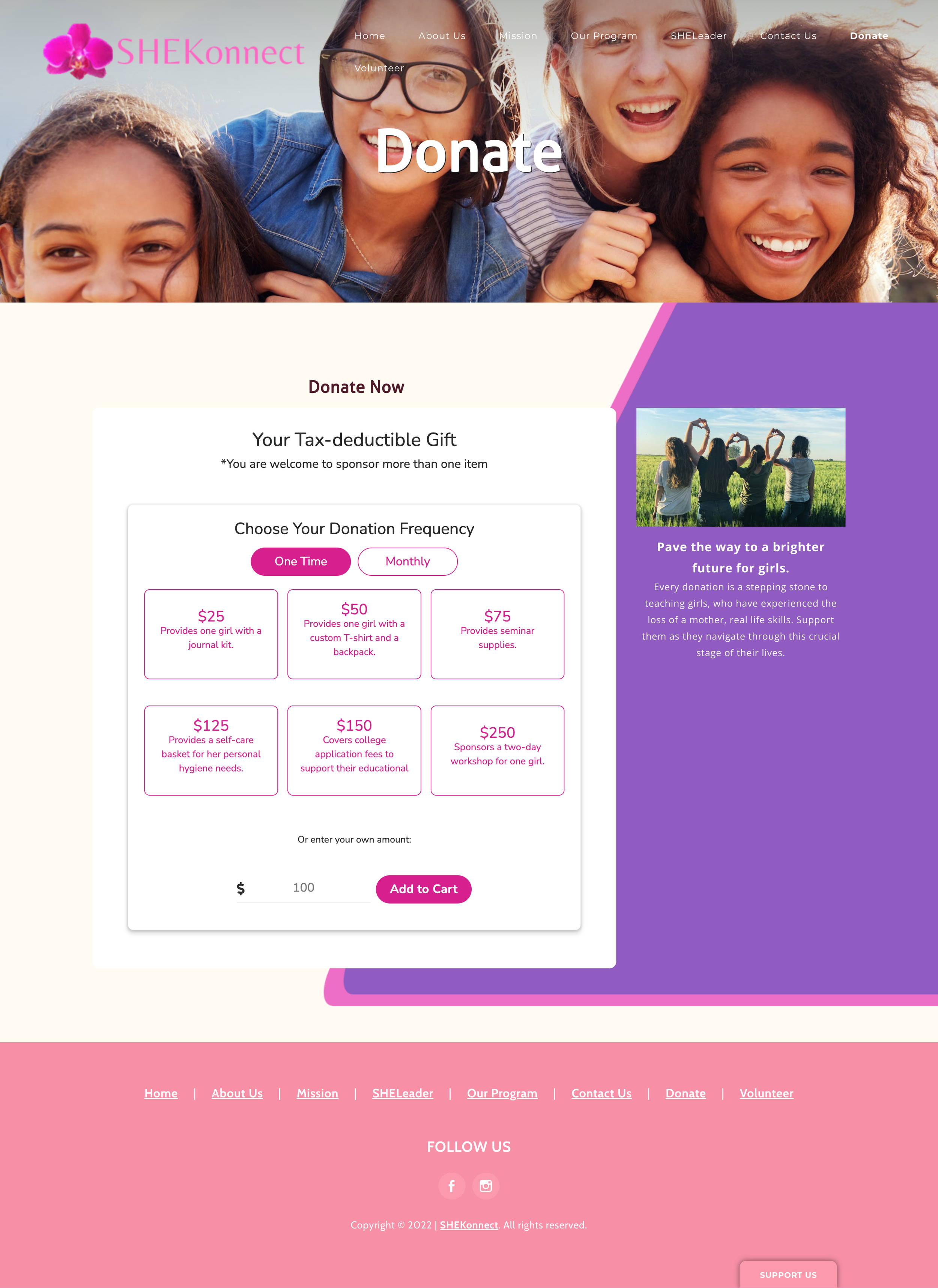
SHEKonnect Donation Page Re-design
What’s the problem:
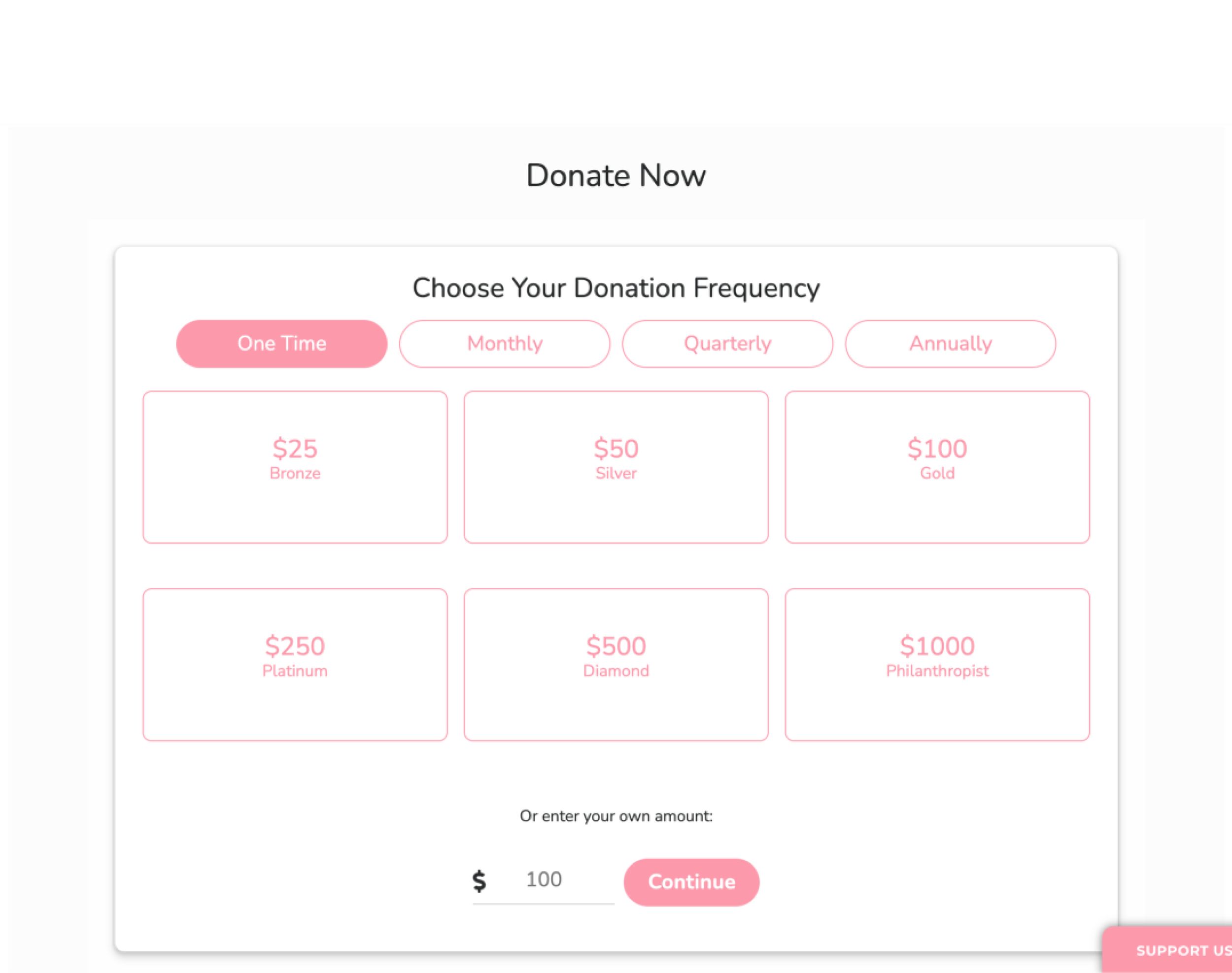
1. The donation amount section had low color contrast, affecting the readability.
2. Visuals are lack of brand identity.
Design Goals:
Create an eye-catching, intuitive, and informative donation UI.
Difficulties:
The donation component is a widget created by the platform(Flipcause). There are a lot of limitations to changing its style. For example, The font color will only adapt to the button color.
Click the pic below to see the webpage.
Final Design
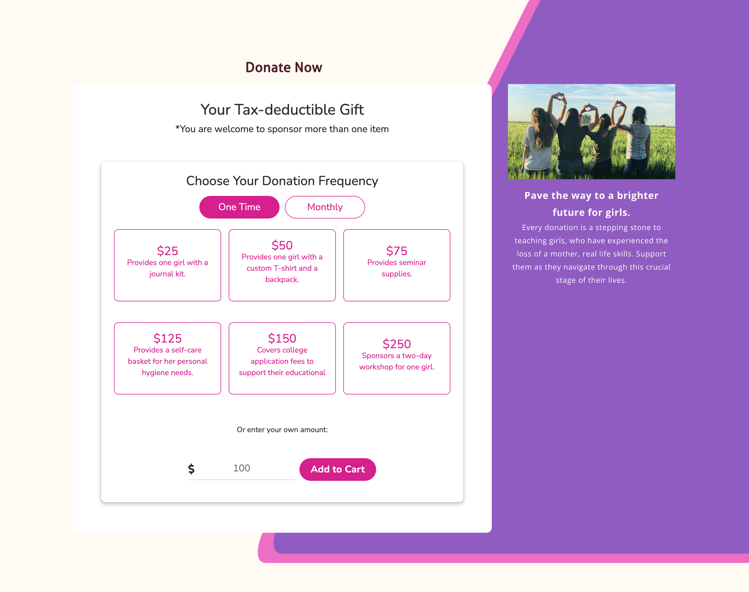
1. Integrate the brand color scheme in UI of this page: SHEKonnect has a set of color palettes. I apply them to the background and the main font color to create a visual identity. By doing this, we can amplify our brand awareness.
2. Improve color contrast to improve readability: The old donation section has low color contrast(color contrast ratio: 2.03) which doesn’t pass the WCAG level. The font and border color have a higher contrast ratio(3.9) which matches the requirement of WACG level on large texts.
3. Provide additional information: Compared to the old donation section showing only the donation amount, the new one shows the exact supplies below every amount block so that users will have a clearer picture of what their money will be used for. Also, the texts on the right side of the donation widget address the impact the donation will have.
Before
After


