UI Design for travel booking website
Design pattern that I utilized in this project
-
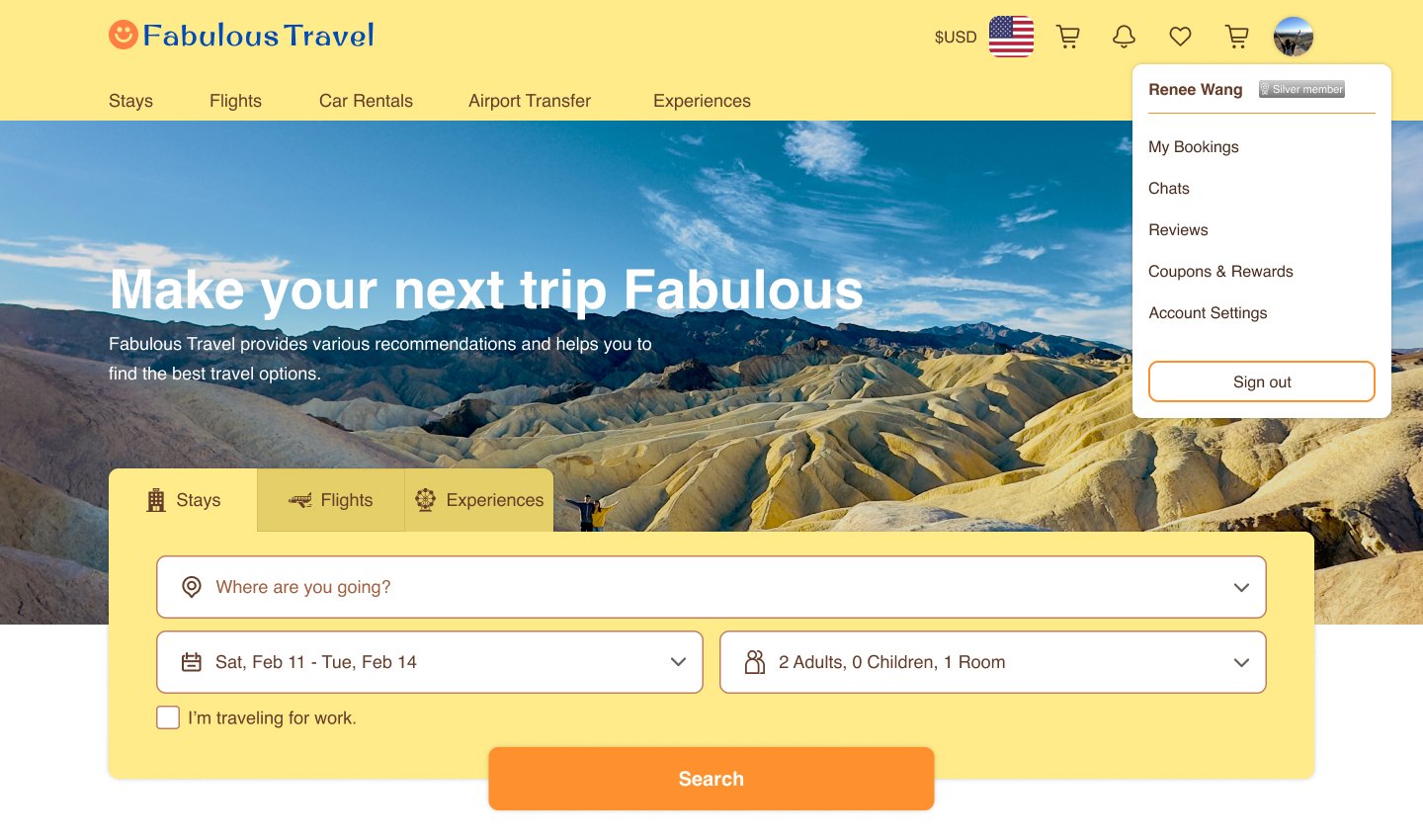
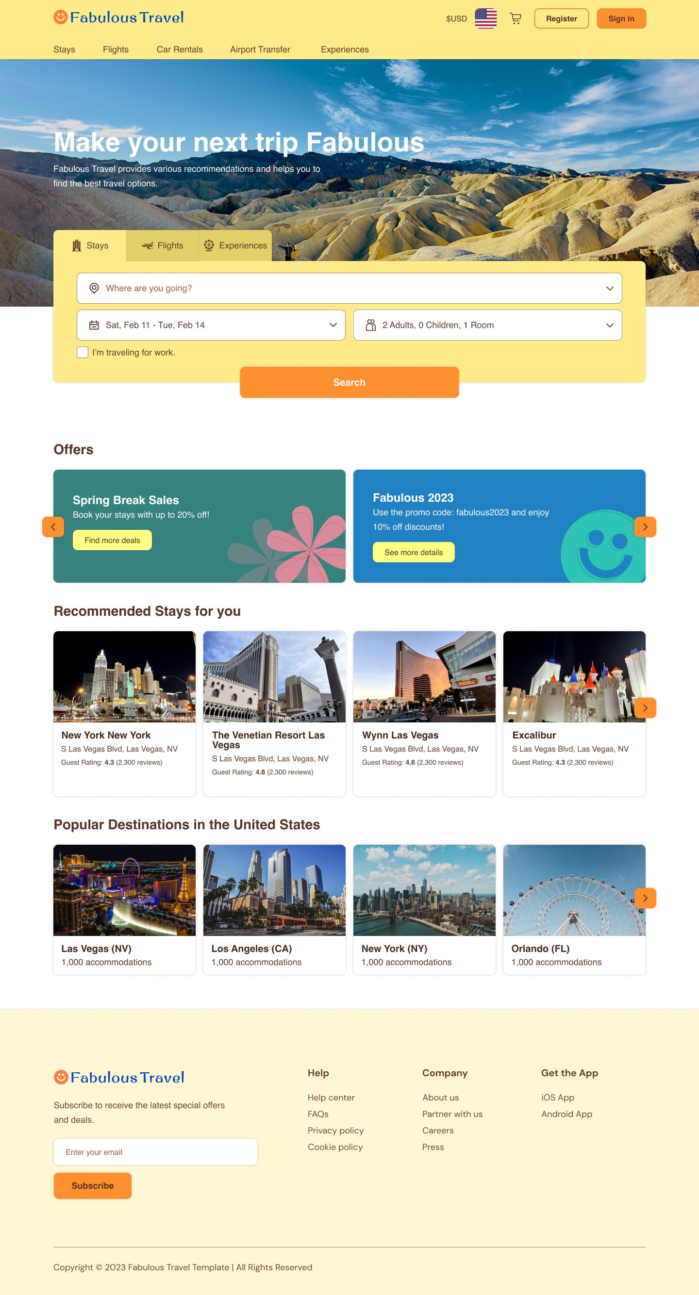
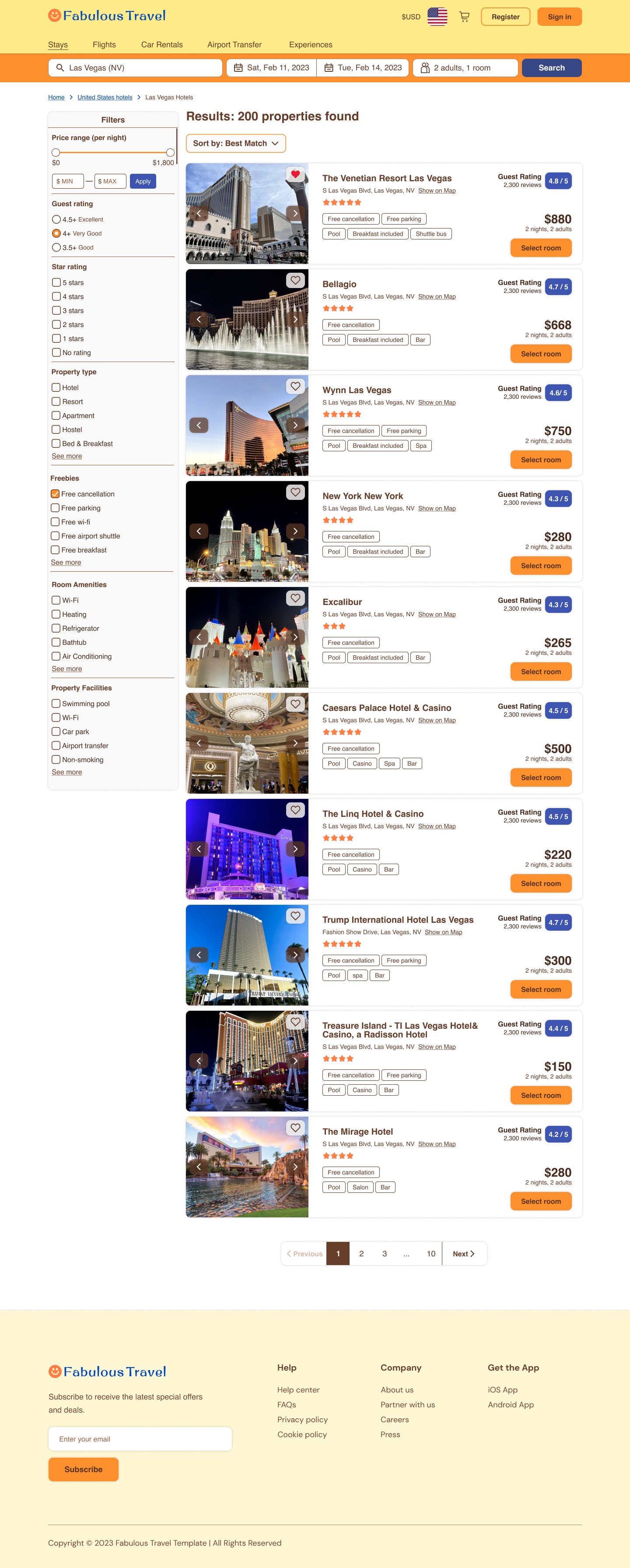
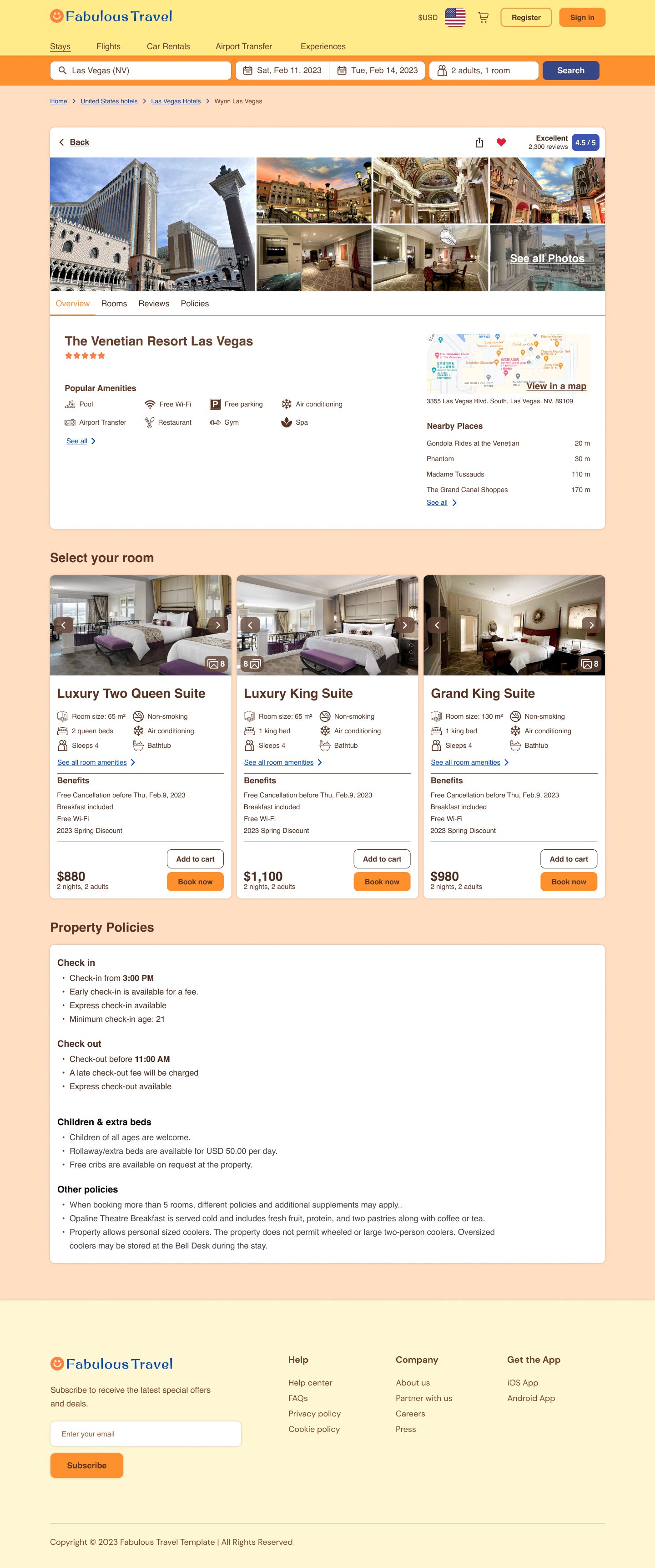
Global navigation is applied in the website as users can switch the product categories they want to search for without getting back to the homepage. Sign-in tools are also deployed at the upper right corner in every page since most users are accustomed to the position and it reduces their time figuring out where to find those functionalities. Additionally, I put other important site links divided by category labels in the footer, such as FAQs, company-related info and app download page, because those sites are not directly related to the main task of the website. In search results pages, breadcrumb shows each level of the given search results and it allows users get back to the results of last few levels.
-
As a task-centric website, I choose “Feature, search and browse” pattern to express the information architecture and put emphasis on the “search” functionality by displaying the search field at the screen-width panel on the top of the page. Users who click to my website mostly want to find some travel products to book or purchase and they expect a quick and simple search process, so searching is the most important task of my website.
That’s why I implement a prominent done button in the search module which makes users certain that they will be lead to the results page once the button is clicked. Then, some info about the products(offers and recommendations) are listed below the search module using carousel pattern. Therefore, users can browse quickly because they don’t have to scroll down the page frequently.
-
List: I’m opt for cards combined with pagination pattern. This way of demonstration allows users to compare multiple properties easily and is easy for us to add information of the properties.
Filter and Sorting: Except for the price range, I provide all the filter options for users to choose. Checkboxes indicate multiple choices and radio buttons indicate single choices.In terms of the price range filter, I utilize slider for users to choose the price range flexibly. For the keyboard only users, they can type the number in the numeric input below the slider instead. As for sorting, I choose the sorting functionalities according to what other e-commerce sites usually apply, such as best match, by price, and by customer ratings. As we know that when people purchase something, they care about the quality and the price. Therefore, those methods can help customers make their decision on booking.
-
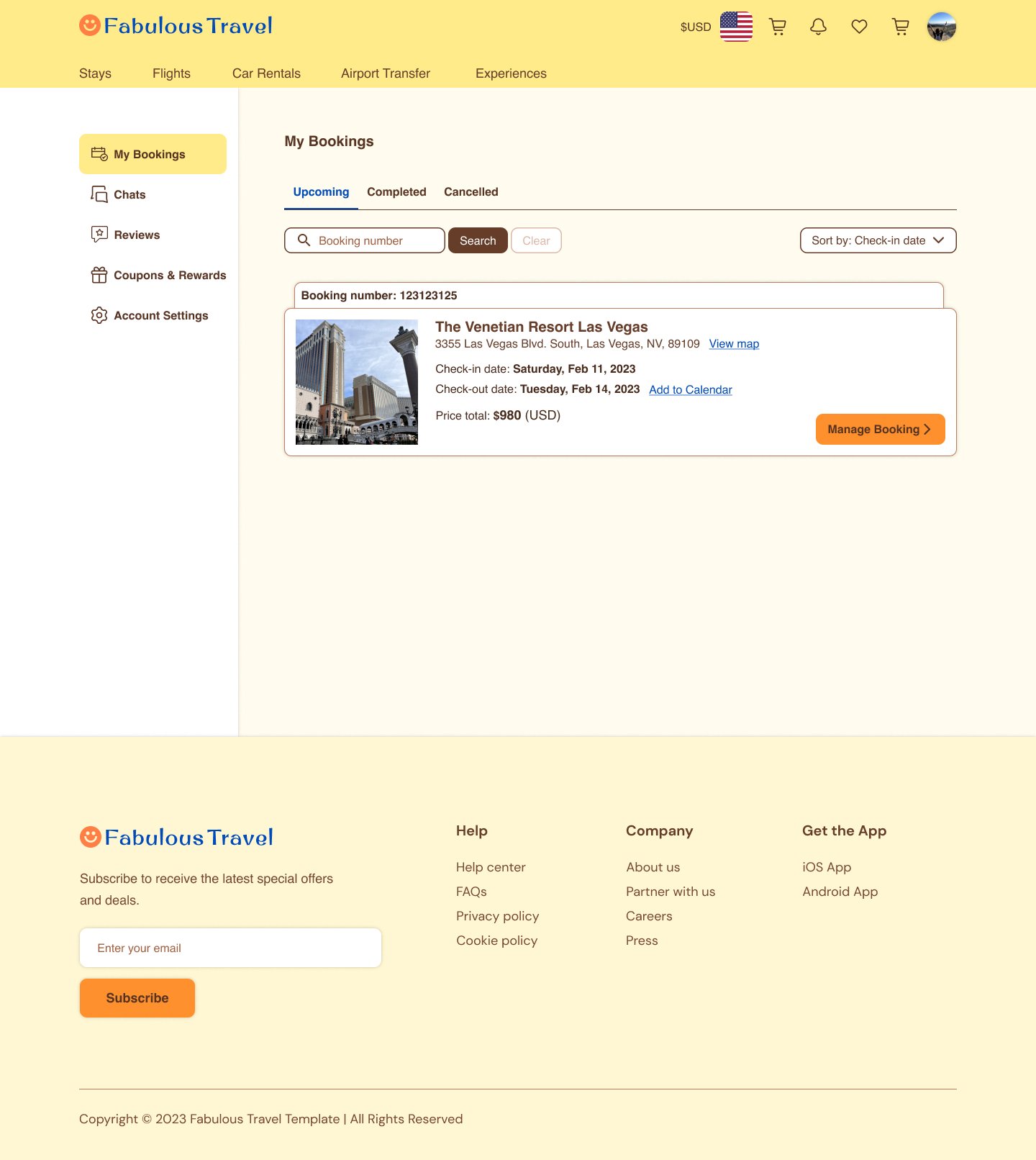
Split view is implemented in the account page, users can easily change the selections with single mouse click and it has enough space to display the contents(i.e. booking details and account settings).
In “my booking” section, users can find their booking info through booking number or sort their bookings by check-in date and booking date if they have multiple bookings.
